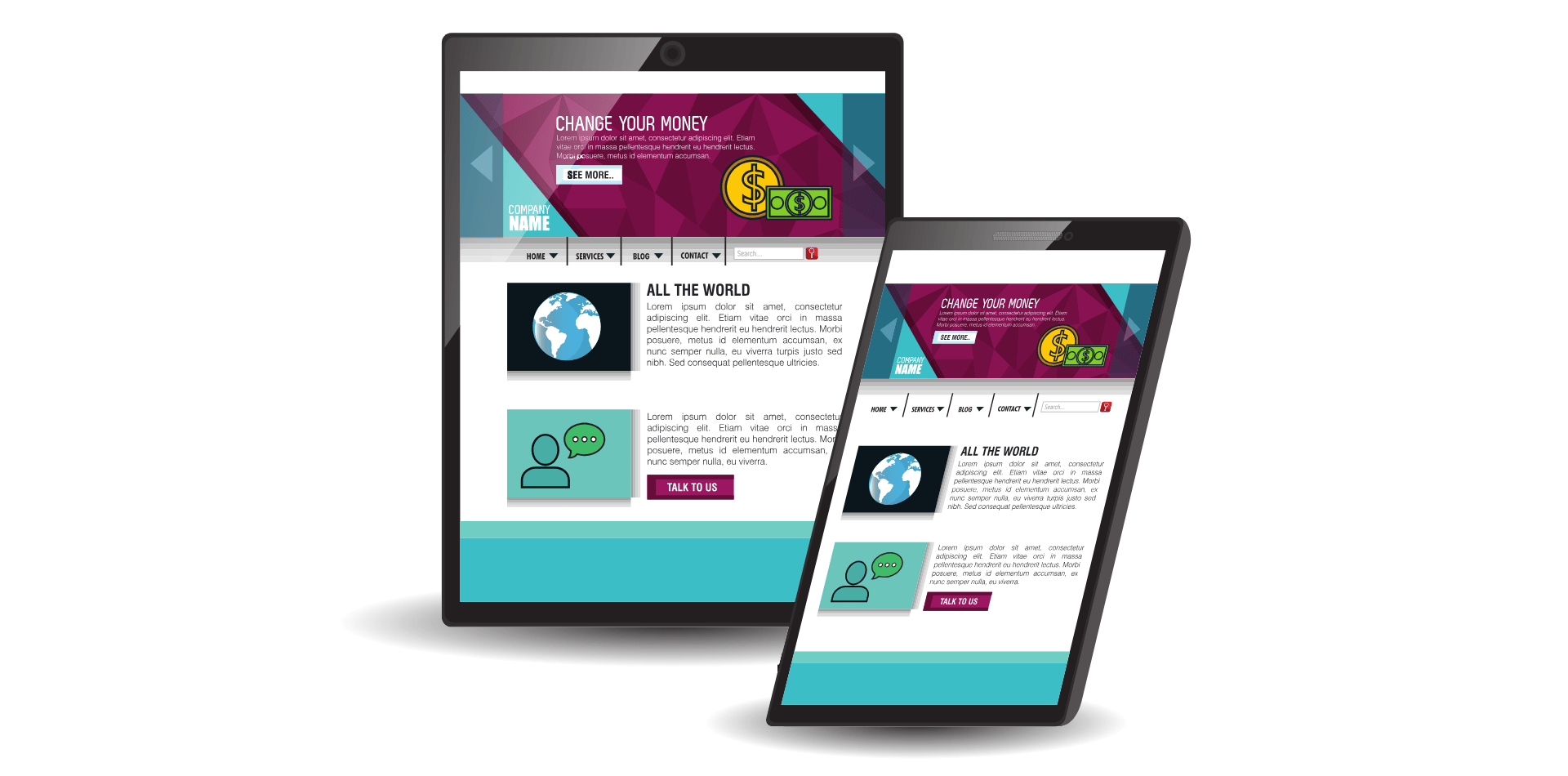
How Can I Improve My Existing Website Design?
How Can I Improve My Existing Website Design?

Improving an existing website design can significantly boost its performance, user engagement, and overall success.
If your current website isn't delivering the results you expected, a strategic approach to redesign and optimisation can make all the difference.
Below are some detailed steps to help you enhance your website's design and functionality.
1. Conduct a Comprehensive Website Audit
A website audit is the first step in identifying areas of improvement.
This process involves analysing various aspects of your site to determine what’s working well and what needs enhancement.
Here’s how you can conduct an effective audit:
- Performance Analysis: Use tools like Google PageSpeed Insights or GTmetrix to assess your website’s load times. Slow performance can deter users and negatively impact SEO. Analyse factors like image sizes, server response times, and the use of plugins that may be slowing down your site.
- Mobile Responsiveness: With the increasing use of mobile devices, your site must be fully responsive. Test your website on various devices and screen sizes to ensure it adapts seamlessly. Google’s Mobile-Friendly Test tool can help identify mobile usability issues.
- SEO Audit: Evaluate your website’s SEO using tools like Ahrefs, Moz, or SEMrush. Check for keyword optimisation, meta tags, alt text for images, and the overall structure of your content. An SEO audit can reveal areas where you can improve your rankings in search engine results.
- User Experience (UX): Analyse how users interact with your site. Tools like Hotjar or Crazy Egg can provide heatmaps and user session recordings, showing where users click, scroll, or drop off. This data helps identify pain points in navigation or content layout.
- Content Analysis: Assess the quality and relevance of your content. Is it up-to-date, engaging, and valuable to your audience? Content that no longer serves its purpose should be revised or removed.

2. Update and Optimize Content
Content is the backbone of your website.
Regularly updating and optimising your content can lead to better user engagement, improved SEO, and a higher conversion rate.
Here’s how you can achieve this:
- Content Refresh: Review your existing content and update it with the latest information, statistics, and insights. This is particularly important for blog posts, product descriptions, and case studies. Fresh content not only keeps your audience engaged but also signals to search engines that your site is active and relevant.
- Keyword Optimisation: Revisit your content with a focus on SEO. Incorporate relevant keywords naturally into your text, headings, and meta descriptions. Avoid keyword stuffing, which can hurt your SEO efforts. Use tools like Google Keyword Planner or Ubersuggest to find new keyword opportunities.
- Content Gaps: Identify content gaps where you could provide more value to your audience. For example, if you notice that a competitor covers certain topics that you don’t, consider creating content on those subjects.
- Visual Content: Incorporate more visual content such as infographics, videos, and images. Visuals can make your content more engaging and easier to digest. Ensure that all visuals are high quality, relevant, and optimised for fast loading times.
- Internal Linking: Improve your internal linking structure to help users and search engines navigate your site more effectively. Link related content together to keep users engaged and reduce bounce rates.
3. Optimize for Mobile
With the majority of internet traffic now coming from mobile devices, optimising your website for mobile is non-negotiable.
A mobile-friendly design ensures that your site provides a positive user experience across all devices.
Here’s how to optimise your site for mobile:
- Responsive Design: Ensure your website uses a responsive design framework that automatically adjusts to different screen sizes and orientations. This includes flexible grids, responsive images, and CSS media queries.
- Mobile-First Approach: Consider adopting a mobile-first design approach, where you design for the smallest screen first and then scale up. This ensures that essential features are accessible on mobile, and nothing is lost when the screen size increases.
- Simplified Navigation: Mobile users need easy access to content with minimal clicks. Simplify your navigation menu by using drop-downs, collapsible sections, or hamburger menus that expand when needed.
- Touch-Friendly Elements: Design buttons, forms, and other interactive elements to be easily clickable on touchscreens. Ensure they are large enough and spaced apart to avoid accidental clicks.
- Optimise Load Times: Mobile users often have slower internet connections. Optimise your site’s performance by compressing images, minimising CSS and JavaScript, and using accelerated mobile pages (AMP) where appropriate.

4. Improve Load Times
Website speed is a critical factor in user experience and SEO.
A slow-loading site can lead to high bounce rates, frustrated users, and lower search engine rankings.
Here are ways to improve your website’s load times:
- Image Optimisation: Large images can significantly slow down your site. Use image compression tools like TinyPNG or ImageOptim to reduce file sizes without compromising quality. Also, consider using modern image formats like WebP, which offer better compression than JPEG or PNG.
- Leverage Browser Caching: Browser caching stores static files like images, CSS, and JavaScript locally in the user’s browser, so they don’t have to be downloaded every time the user visits your site. Configure your server to enable caching with a long expiration time for these files.
- Minimise HTTP Requests: Each element on your webpage, such as images, scripts, and stylesheets, requires a separate HTTP request. Reduce the number of requests by combining files, reducing image count, and eliminating unnecessary plugins or scripts.
- Use a Content Delivery Network (CDN): A CDN distributes your site’s content across multiple servers worldwide. When a user visits your site, the CDN serves content from the server closest to them, reducing load times. Services like Cloudflare or Amazon CloudFront can help with this.
- Optimise CSS and JavaScript: Minify your CSS and JavaScript files to reduce their size by removing unnecessary characters, spaces, and comments. Also, consider asynchronous loading for scripts that don’t need to load immediately, allowing the rest of the page to load faster.
5. Enhance Navigation
Good website navigation is crucial for user experience.
It allows visitors to find the information they need quickly and easily, which can lead to higher engagement and conversion rates.
Here’s how to enhance your site’s navigation:
- Simplify the Menu Structure: Ensure your navigation menu is clear, concise, and easy to understand. Limit the number of menu items to avoid overwhelming users. Group related pages under appropriate categories and use dropdowns or mega menus for large sites.
- Add a Search Function: A search bar is invaluable for helping users find specific content quickly. Ensure your search function is prominently placed and provides relevant results. Use autocomplete features to enhance the user experience further.
- Breadcrumbs: Incorporate breadcrumb navigation to help users understand their location on your site and easily navigate back to previous pages. This is especially useful for sites with deep hierarchies or large amounts of content.
- Consistent Navigation Across Pages: Maintain a consistent navigation structure across all pages to avoid confusing users. This includes keeping the menu in the same location and using the same design elements throughout the site.
- Highlight Important Pages: Use visual cues like buttons or highlighted menu items to draw attention to important pages, such as “Contact Us,” “Shop,” or “Blog.”
6. Incorporate Modern Design Elements
Staying current with design trends can make your website feel fresh, modern, and engaging.
Here are some ways to incorporate contemporary design elements into your site:
- Minimalist Design: Embrace minimalism by focusing on essential elements and removing any clutter. Use plenty of white space to create a clean, open layout that guides users’ attention to key content.
- Custom Illustrations and Graphics: Instead of relying solely on stock photos, consider incorporating custom illustrations and graphics that reflect your brand’s personality. Unique visuals can make your website stand out and feel more personalised.
- Microinteractions: Microinteractions are small, subtle animations or effects that occur when a user interacts with elements on your site, such as hovering over a button or scrolling through a page. These interactions add a layer of engagement and can make your site feel more dynamic.
- Dark Mode: Offering a dark mode option can enhance the user experience, especially in low-light environments. This trend has gained popularity for its visual appeal and ability to reduce eye strain.
- Bold Typography: Experiment with bold, large-scale typography to create visual interest and make key messages stand out. Ensure that the typography aligns with your brand identity and enhances readability.

7. Conduct A/B Testing
A/B testing (also known as split testing) is a powerful method for optimizing your website design by comparing two versions of a page or element to see which performs better.
Here’s how to effectively use A/B testing:
- Identify Key Areas to Test: Focus on elements that directly impact user experience and conversion rates, such as headlines, CTAs, images, layouts, and forms. For example, you might test two different headlines to see which one drives more clicks or conversions.
- Create Variations: Develop a variation of the element you want to test. Ensure that the changes are significant enough to potentially impact user behaviour but not so drastic that they confuse or alienate users.
- Set Clear Goals: Define what success looks like for each test. This could be higher click-through rates, lower bounce rates, more form submissions, or increased sales. Use analytics tools like Google Optimise or Optimisely to track these metrics.
- Run the Test: Launch the A/B test by directing a portion of your traffic to each version. Ensure that the test runs for a sufficient period to gather meaningful data, typically a few weeks, depending on your traffic volume.
- Analyse Results and Implement Changes: Once the test is complete, analyse the results to determine which version performed better. If the variation shows a significant improvement, implement the changes permanently. Continue testing other elements to further refine your site.
Conclusion
Improving your existing website design is an ongoing process that requires careful analysis, strategic updates, and a willingness to adapt to new trends and technologies.
By conducting a comprehensive audit, regularly updating content, optimising for mobile, improving load times, enhancing navigation, incorporating modern design elements, and utilising A/B testing, you can significantly boost your website’s performance, user engagement, and conversion rates.
Remember, a well-designed website is a powerful tool that can drive your business forward in the digital age.


